Mastering Seamless Navigation: How to Design a User-Friendly Website Experience

Navigation is the backbone of any website, guiding users to find the information or products they need. A well-structured navigation system not only improves the user experience but also enhances engagement, ensuring visitors can explore your content with ease. Here's how to craft an intuitive and effective navigation system for your website.
Key Factors to Consider When Designing Effective Navigation
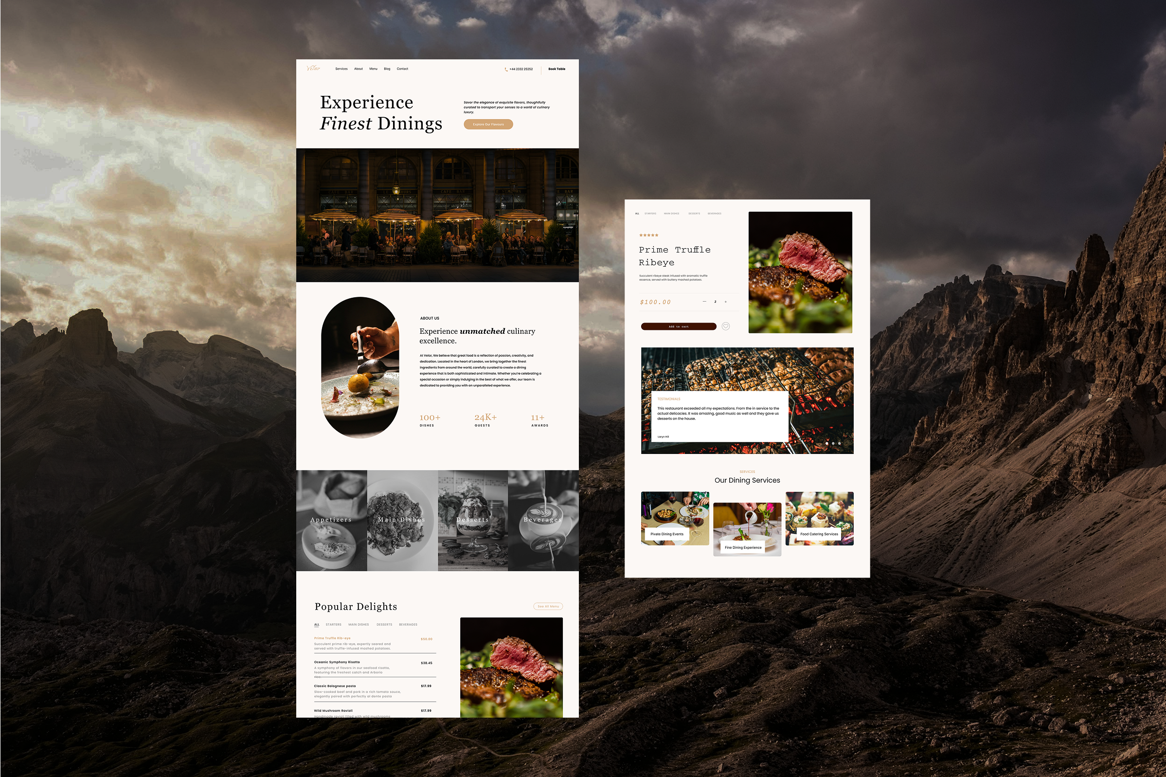
Visual Hierarchy & Design
How do you direct a visitor’s attention when they first land on your page? A solid visual hierarchy will guide users through your website naturally, from the most important content to the least. Using design elements like size, colour, and spacing helps to highlight key areas and makes the overall navigation more intuitive. Take a moment to assess whether your navigation design is clean and logical, or if there’s anything you could tweak to make it more effective at guiding your users. Could your menu use larger icons, better contrast, or perhaps a clearer layout?
Simplicity & Clarity
A cluttered navigation menu can confuse visitors and create frustration. Instead, keep it simple and focused on the essentials. Highlight your core content and avoid overwhelming users with too many options. This approach not only ensures that visitors find what they need quickly, but also helps streamline their overall journey through your site. Try analysing your menu to see if anything can be consolidated or removed. Have you simplified it enough for your users to make quick decisions?
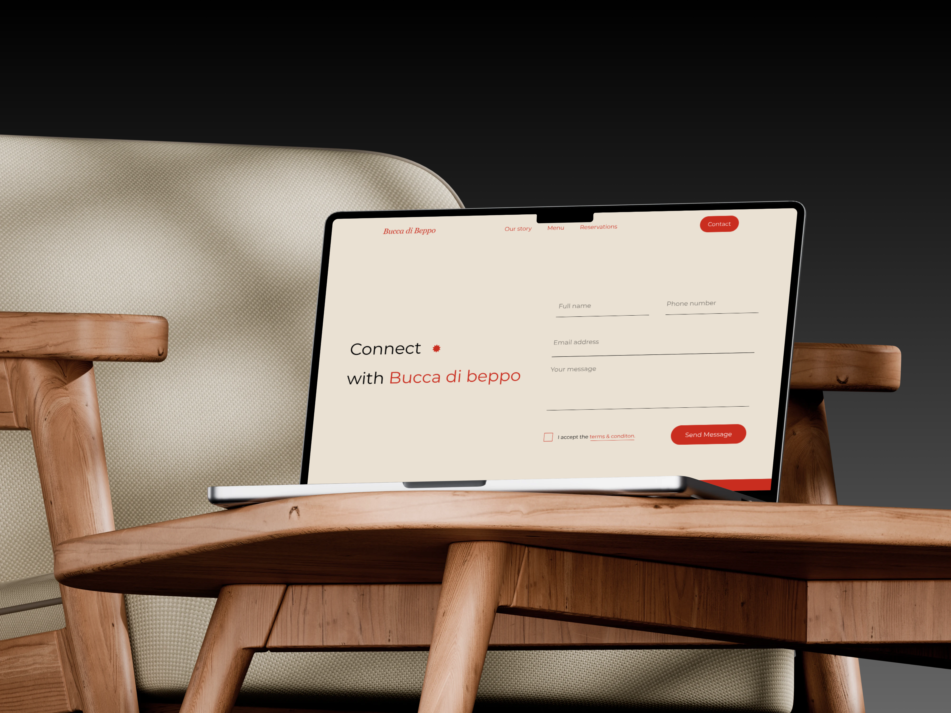
Is Your Navigation Consistent Across All Pages?
When a visitor jumps from one page to another, they should instantly recognize where they are and how to get around. Consistency in your navigation ensures that users can comfortably explore your website without having to relearn how to navigate each page. If you’ve ever been on a site where the menu structure changes between pages, you’ve probably felt a little lost. Check that your navigation stays consistent across all devices and pages, as this creates a seamless experience that feels both
Is Your Navigation Optimized for Both Mobile and Desktop?
The way users interact with websites differs between devices, which is why mobile responsiveness should be a top priority. Menus that are easy to use on desktop might not be as effective on mobile. Consider features like collapsible menus or touch-friendly buttons that make navigating on smaller screens a breeze. Test your navigation on various devices to ensure a smooth experience.
User Testing & Iteration
Even with the best intentions, there’s no one-size-fits-all solution to navigation. The only way to truly know what works is through real-world testing. User feedback and behaviour analysis are invaluable tools to refine your navigation system. Set up usability tests or ask users for feedback on their navigation experience. Be open to making adjustments—an effective navigation system is one that evolves. Have you already gathered user feedback on your navigation, or could you run a test to identify possible improvements?
In Conclusion
Effective navigation goes beyond design; it’s about enhancing the user experience and ensuring visitors find what they need with ease. By focusing on simplicity, consistency, responsiveness, and design principles, and incorporating regular testing, you’ll create a navigation system that keeps users engaged and coming back. Regularly revisiting and refining your navigation will ensure it continues to meet user needs and contributes to a smooth, enjoyable browsing experience.
OTHER ARTICLES